Dear camille

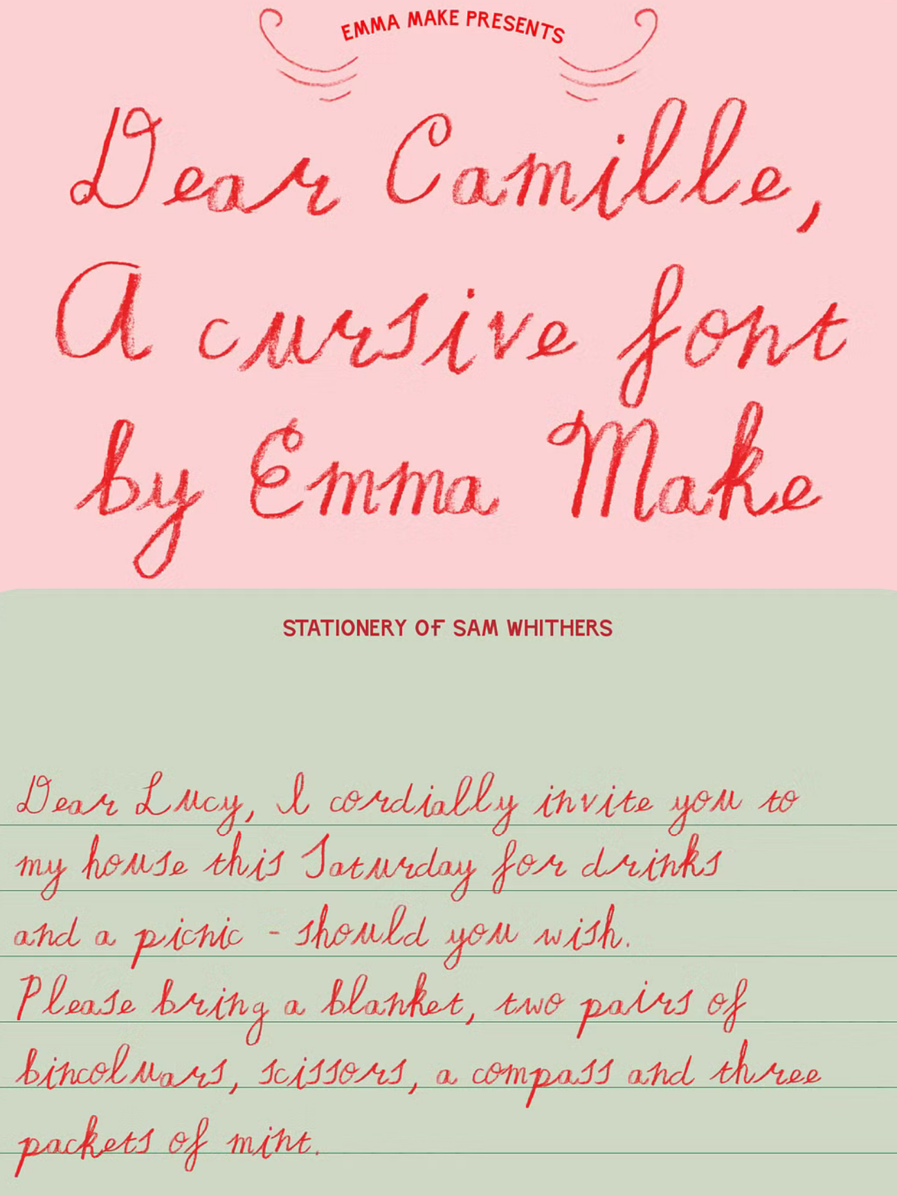
this font feels like it was written by someone who still uses pencil crayons on purpose. slow, tender, a little wobbly — like a love letter from a wes anderson character who took the time to line the paper by hand.

everything about it centers the innocent archetype — the handmade quality, the imperfection, the darlingness. it doesn't try to be polished. it tries to be real. and that's what makes it beautiful.

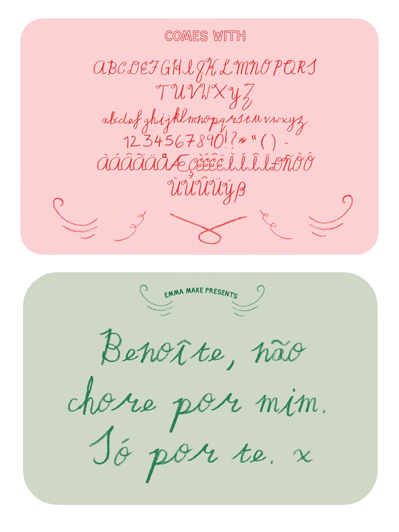
dear camille is a handwritten pencil crayon typeface with the tenderness and character of something passed between friends. perfect for letters, stationery, invitations, websites — anywhere your brand wants to feel human, unhurried, and sweetly deliberate.

available as .OTF and .TTF files.

You can purchase ‘dear camille’ at creative market starting at $20.

Kate Ellen

I’m founder of Azure Vault Studios—a space where digital storytelling meets transformation, like if The Labyrinth had a baby with Queer Eye.

Drawing on 15 years as the CEO of my jewelry brands Wovekind and Crown Nine, I’ve learned one thing: every person has a unique light waiting to shine. (Yes, even you. Especially you.)

My superpower? Seeing that light, even when it’s buried under a pile of self-doubt or bad stock photos, and turning it into a digital presence that feels as authentic and powerful as a Prince guitar solo.

Just as alchemists transform lead into gold, I help you step into your brilliance and create a website that’s not just a site—it’s a vibe. Because the world doesn’t need more boring beige brands. It needs you, in all your weird, wonderful glory.

https://www.azurevaultstudios.com
Previous
Previous

the idealist

Next
Next

hello tobi